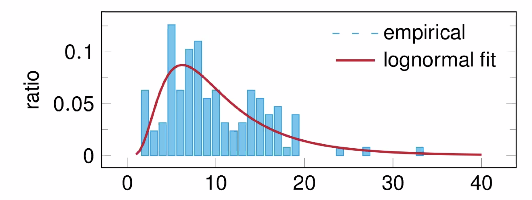
Histogram
Visualization of tabulated frequencies, shown as bars.
It shows what proportion of cases fall into each of several categories.
Differs from a bar chart in that it is the area of the bar that denotes the value, not the height as in bar charts, a crucial distinction when the categories are not of uniform width.
The categories are usually specified as non-overlapping intervals of some variable.
The categories (bars) must be adjacent.