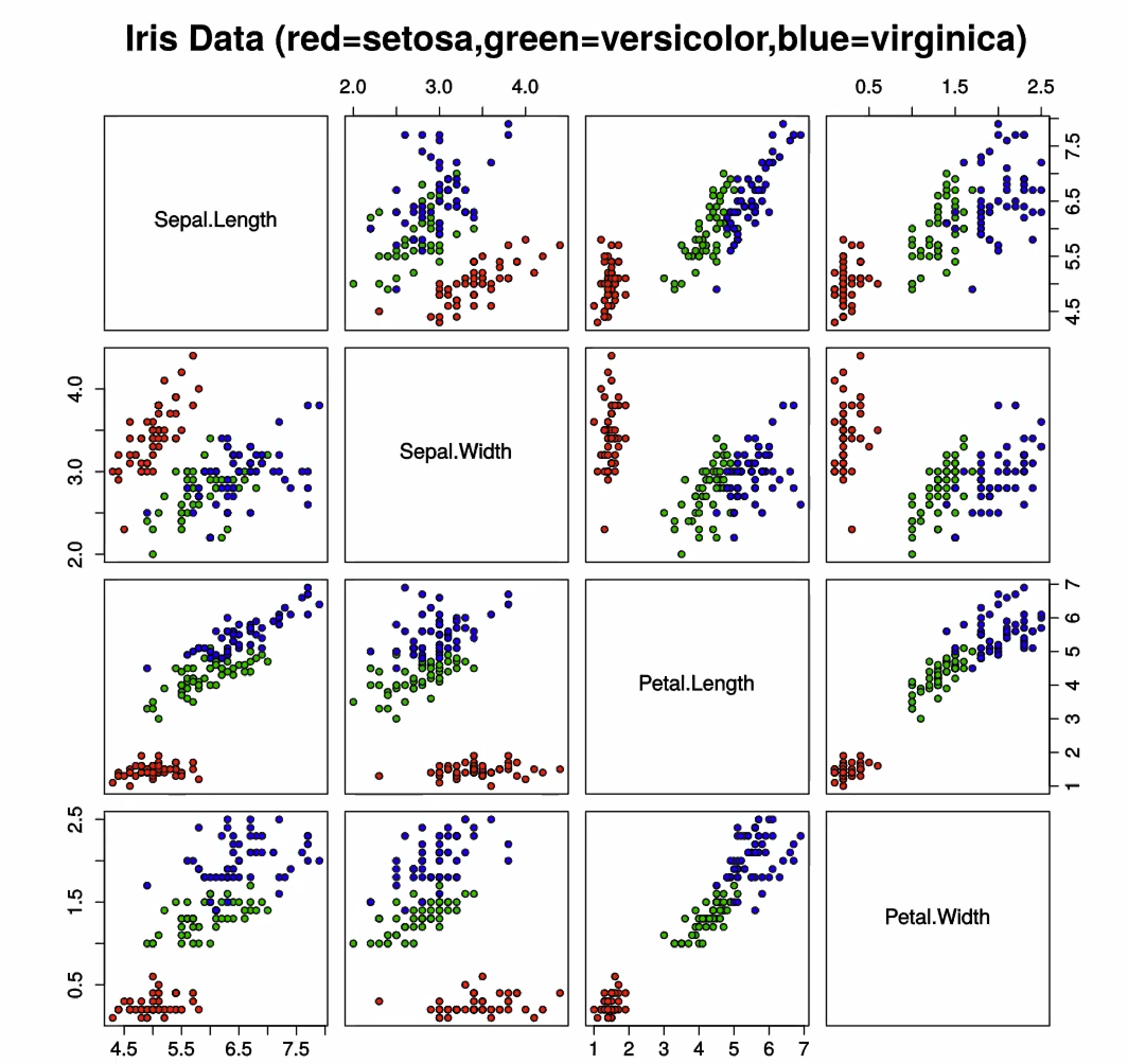
Scatter Plot Matrices
Multiple Scatter Plots to show Correlation or Clustering for multiple attributes. Use Histogram for diagonal line. Similar to a Heatmap if only used for Correlation.
Interaction
- reduce number of varibales
- change axis order
- Brushing, just like in Parallel Coordinate Plot
Disadvantages
- limited space
- hard to understand with too many variables
Example