Scatter Plot
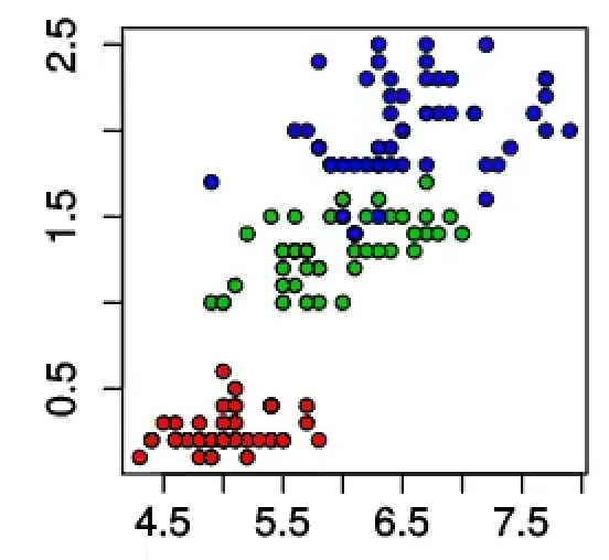
Is used to show Correlation or Clustering between two attributes of a Dataset.
Interactions
- swap x and y axis
- change Color based on attribute
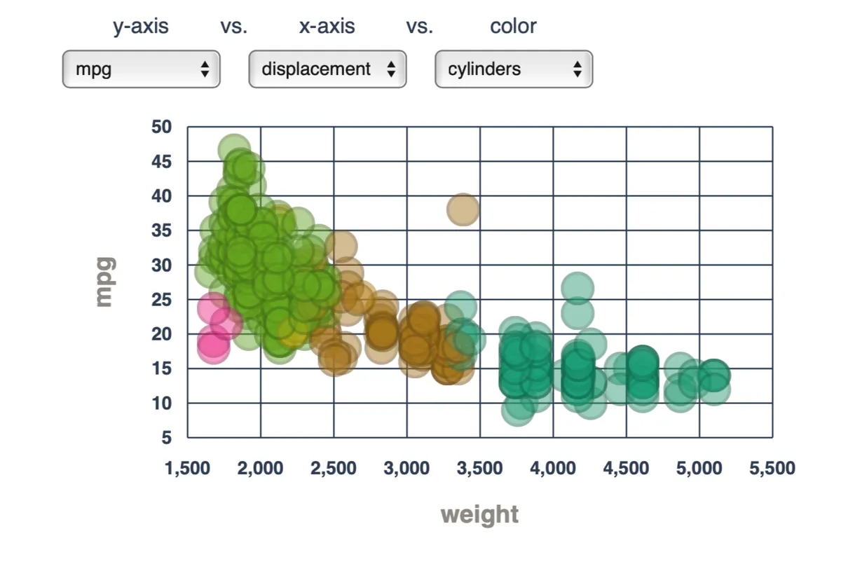
This is how an interactive scatter plot might look like:
Is used to show Correlation or Clustering between two attributes of a Dataset.
This is how an interactive scatter plot might look like: